How We Transformed Overwhelming Forms into Tailored, User-Friendly Experiences
Imagine logging into your accounting platform, only to be faced with a daunting form containing 50 input fields just to add a new client. Overwhelming, right?
Now picture having the ability to customize that form to show only the inputs you need - whether it’s just 4 fields or 25 - making data entry faster and more intuitive. This was the challenge our users faced, and I took the lead in designing a solution that would transform this overwhelming experience into something far more user-friendly.
Context: Part of Bansira Accounting at Quantum Dynamics - I owned the form redesign end to end.
Constraints: No database changes - it had to work purely on the front end. One form had to serve both Individual and Business clients, keep all 50 fields available for users who need them, and lock the 4 fields required to create a client. Designed in about 10 days.
Outcome: 90% fewer user errors, measured through usability testing over video calls.
Problem Statement
During user testing of the Accounting module, we observed that many data entry forms, such as those for Clients and Business, included around 40-50 input fields, which was overwhelming for users.
Users didn’t always need all the fields, and the sheer volume made the process tedious and overwhelming. Different users had varying input needs - some required only 4-6 fields, while others needed 25-30 fields.
Our challenge was to simplify the forms to improve usability, accessibility, and efficiency, making data entry faster and more user-friendly.
Objectives
Improve Usability
Simplify the form interface to reduce cognitive load and make data entry less overwhelming.
Increase Accessibility
Provide flexibility so that users with varying needs can easily navigate and use the forms without excessive scrolling or tapping.
Enhance Customisation
Allow users to tailor the forms according to their specific input requirements without cluttering the interface.
Initial Approaches and Challenges

Tabs
Grouped fields into tabs and sections, but this still overwhelmed users as the number of inputs remained high.

Accordions
Collapsed fields under expandable sections to reduce the visual load, but the expanded forms were still cumbersome for users who only needed a few fields.

Typeform Approach
This method displayed one input field at a time. While it reduced cognitive load, users with many inputs had to interact multiple times, which slowed down data entry for those who required more fields.
Personas
S
Sarah, the Small Business Owner
Role: Owner of a small retail business
Needs: Sarah only requires basic inputs such as name, address, contact details, and email when adding a new client. She values efficiency and dislikes unnecessary complexity.
Frustrations: She finds long forms overwhelming and time-consuming since she doesn't need most of the available fields.
Goal: To quickly add clients with minimal input.
D
David, the Finance Manager
Role: Manager at a mid-sized company, handling financial data and reporting
Needs: David needs a moderate number of fields to fill in more detailed information, such as tax ID numbers, account details, and business information, but not all 50 inputs.
Frustrations: While he needs more fields than Sarah, he finds unnecessary fields distracting and wants to tailor the form to his needs.
Goal: To have the flexibility to add relevant fields and hide irrelevant ones to streamline his workflow.
Solution: Dynamic, Customisable Forms
After extensive ideation and testing various approaches, I led the design of a solution that offered both simplicity and flexibility. The goal was to create a form system that could adapt to different user needs, also catered to various client types - whether individual or business. Here’s a deeper look into how we achieved this:

Essential Fields Based on Client Type
To address the challenge of too many fields, I designed the forms to dynamically display the four most essential input fields based on the client type - Individual or Business.
These core fields are non-customisable - users cannot enable or disable these four essential inputs.
This ensures that every user starts with the correct, relevant inputs based on their client type, preventing unnecessary confusion or the need for manual adjustments.
Enable/Disable Additional Fields
Not all users need the same level of detail. A user may require 20-25 fields to capture detailed client data, while others might only need 10.
So, beyond the essential fields, users have the ability to enable or disable additional input fields according to their specific needs. These optional fields are presented as checkboxes alongside the default inputs.
This approach empowers users, giving them control over the form’s complexity.

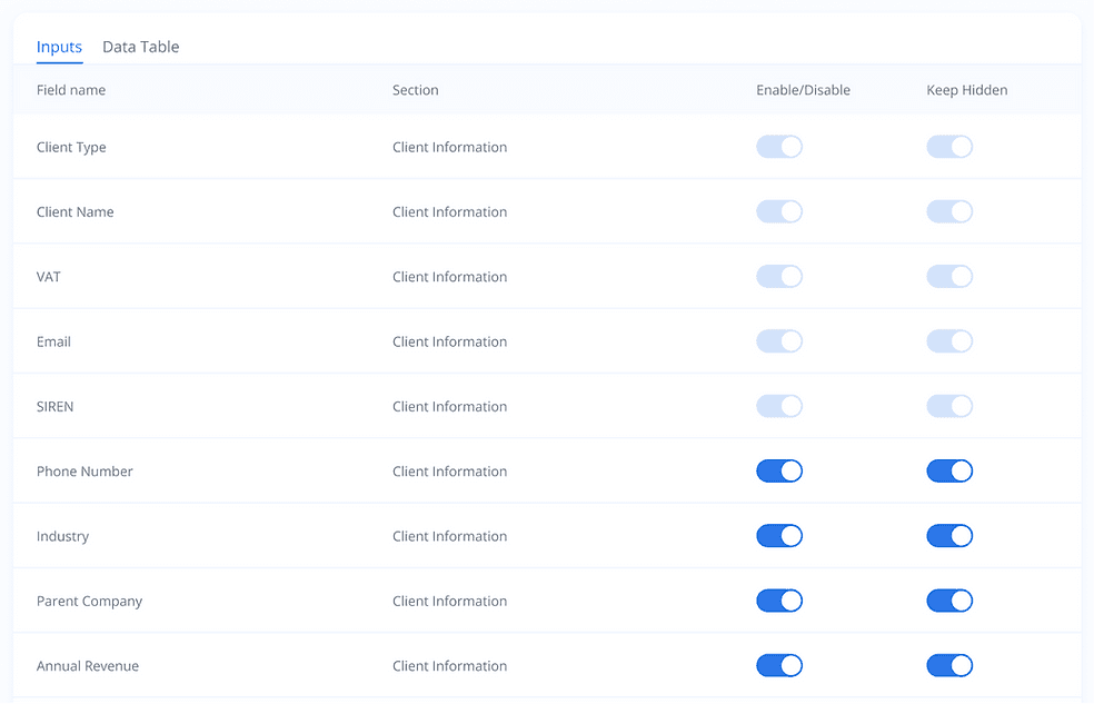
Permanent Form Customisation via Settings
To further enhance the user experience, in settings section users could permanently enable or disable fields based on their preferences.
By allowing users to set their preferences once and retain those preferences across future sessions, we eliminated the need for repetitive form customisations.
The ability to permanently enable or disable fields keeps the form interface minimal.
Impact of Solution
Increased Efficiency: Users experienced a significant reduction in time spent on data entry tasks.
Enhanced User Satisfaction: Reports of user frustration decreased as the forms became simpler and more intuitive.
Customisation Freedom: The ability to tailor forms allowed diverse users to meet their unique requirements seamlessly.
Reduced Errors: The streamlined and relevant field selection process minimised data entry mistakes.
Consistent Workflow: Permanent settings ensured a cohesive and user-friendly experience across sessions.
Fulfillment of Objectives
Usability: Simplified and dynamic forms reduced user overwhelm, leading to faster data entry and enhanced operational efficiency.
Accessibility: The solution catered to a wide range of user needs, accommodating both basic and advanced data entry requirements.
Customisation: By enabling users to toggle fields and set permanent preferences, the forms delivered a personalized and adaptable experience.
Takeaway
What I learned: giving users control over complexity worked better than hiding it. Tabs and accordions only rearranged the 50 fields; letting each user choose their own fields actually removed them.
What I’d do next: track which optional fields people switch on most, and promote the common ones to defaults for each client type.